
Slack Carousel, Card and Alert Blocks: Limits and Errors, Tested
We posted Slack's new carousel and card blocks into a channel and opened alert blocks in a modal, then pushed every field past its limit. Real screenshots, exact errors and the rule that keeps alerts out of messages.
A Slack carousel block is a horizontal row of 1 to 10 card blocks that the reader scrolls with an arrow. Each card can have a hero image, an icon, a title, a subtitle, a body, a subtext line and up to 3 buttons. A card also works on its own, outside a carousel. Alert blocks are different: chat.postMessage rejects them, and they render only in a modal. We tested all three on 5 October 2026 with a throwaway app and a bot token in our free-plan test workspace.
A carousel in a channel
This is one card from the carousel we posted. The full message had five of them in {"type": "carousel", "elements": [...]}:
{
  "type": "card",
  "icon": {"type": "image", "image_url": "https://picsum.photos/id/11/36/36", "alt_text": "icon"},
  "title": {"type": "mrkdwn", "text": "Room 1"},
  "subtitle": {"type": "mrkdwn", "text": "Floor 3, seats 6"},
  "hero_image": {"type": "image", "image_url": "https://picsum.photos/id/11/400/300", "alt_text": "room photo"},
  "body": {"type": "mrkdwn", "text": "Free 2-4 PM. *Projector* included."},
  "actions": [
    {"type": "button", "text": {"type": "plain_text", "text": "Book"}, "style": "primary", "action_id": "book1"}
  ]
}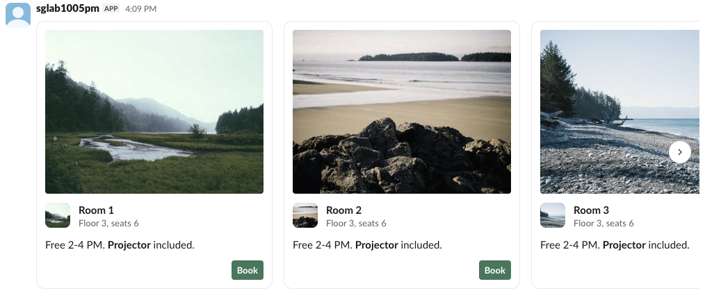
In Slack's web app every card was 340 px wide, and the 400 x 300 hero image was drawn at 314 x 236 px. Three cards fit in our 1440 px wide window; the rest sat behind the arrow. The mrkdwn body rendered bold text. A carousel with one card posted fine and looked like a single card.
Limits and the exact errors
Each failing post returned "ok": false, "error": "invalid_blocks", and the reason in response_metadata.messages:
| Test | Result | Message from Slack |
|---|---|---|
| Carousel, 10 cards | posted | |
| Carousel, 11 cards | invalid_blocks | no more than 10 items allowed [json-pointer:/blocks/0/elements] |
| Carousel, 0 cards | invalid_blocks | must provide at least 1 items [json-pointer:/blocks/0/elements] |
| Carousel holding a section block | invalid_blocks | must be a valid enum value [json-pointer:/blocks/0/elements/0/type] |
| Two carousels in one message | posted | |
| Card, 3 buttons | posted | |
| Card, 4 buttons | invalid_blocks | no more than 3 items allowed [json-pointer:/blocks/0/actions] |
| Card title, 150 / 151 characters | posted / error | must be less than 151 characters [json-pointer:/blocks/0/title/text] |
| Card body, 200 / 201 characters | posted / error | must be less than 201 characters [json-pointer:/blocks/0/body/text] |
| Card with only an icon | invalid_blocks | must define either title, body, hero_image, or actions, each name in backticks [json-pointer:/blocks/0] |
Card with icon and slack_icon | invalid_blocks | Cannot specify both icon and slack_icon [json-pointer:/blocks/0] |
slack_icon with "icon": "calendar" | invalid_blocks | missing required field: name [json-pointer:/blocks/0/slack_icon] |
slack_icon name party | invalid_blocks | must be a valid enum value [json-pointer:/blocks/0/slack_icon/name] |
The slack_icon object takes its icon in name, for example {"type": "icon", "name": "calendar"}, and only names from Slack's fixed list such as calendar, rocket or warning. The Block Kit checker catches these limits before you post.
When we sent a carousel with no top-level text, the post still succeeded and Slack stored Room 1 Floor 3, seats 6 Free 2-4 PM. *Projector* included. as the message text, joined from the first card. That stored text is what clients without carousel support and notifications fall back to, so send your own text.
Never appear "away" on Slack again
Cloud-based. No downloads. Works 24/7 even when your laptop is off.
Button order and the slack_icon card
We sent three buttons in the order primary, plain, danger. Slack drew the danger button on the left and the other two on the right, with primary furthest right, as the reference says:
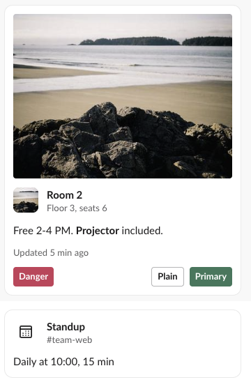
The second card above uses slack_icon instead of an image icon and has no hero image or buttons. subtext renders as a smaller grey line under the body. For a card that tracks a task with steps, see the task card and plan blocks instead.
Alert blocks only work in modals
Every alert block we sent to chat.postMessage failed, whatever its level:
{"ok": false, "error": "invalid_blocks", "response_metadata": {"messages": ["[ERROR] Block type is not supported in this container [json-pointer:/blocks/0]"]}}So we added a slash command to the test app that opens a modal with views.open and one alert block per level:
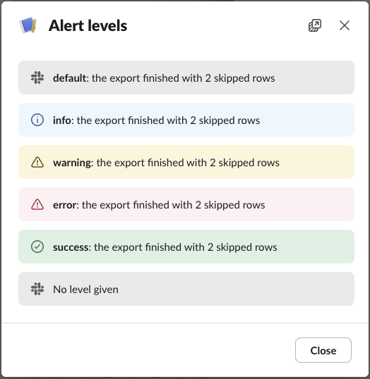
Each level got its own colour and icon. An alert without level drew the same grey bar as "level": "default". Two modal tests failed in views.open with invalid_arguments:
- • 201 characters of alert text:
must be less than 201 characters [json-pointer:/view/blocks/0/text/text]. - •
"level": "critical":must be a valid enum value [json-pointer:/view/blocks/0/level].
When views.open fails, the user sees nothing. The slash command was acknowledged, no modal opened and Slack showed no error, so log the API response yourself.
FAQ
Do carousel and card blocks need a paid Slack plan?
No. Every post above ran on the Free plan.
How do I show a warning inside a channel message, since alerts are modal-only?
Use a context or section block with an emoji such as :warning:; see Slack context, header and divider blocks.
Stop Jiggling Your Mouse.
Join hundreds of remote workers who never worry about their Slack status. Set it up once, stay green forever.
Related Articles
Slack Context, Header, Divider and Actions Blocks: Limits and How They Render
We posted context, header, divider and actions blocks with a bot token and measured the limits, the errors and how Slack's web app draws each one, including the '+ N more' button cut-off.
Slack App Configuration Token: Generate, Rotate and Revoke
An app configuration token lets a script create Slack apps from manifests. We generated one, rotated it five times and tested it again 28 hours later.
Slack App Collaborators: Add, Remove and Transfer Ownership
Collaborators are the people who can edit a Slack app. We added and removed one on 20 November 2026 as a regular member of a test workspace, recorded who can be added and what Slack asks you to do after a removal, and wrote down the hand-over path Slack documents.